Scope of Project
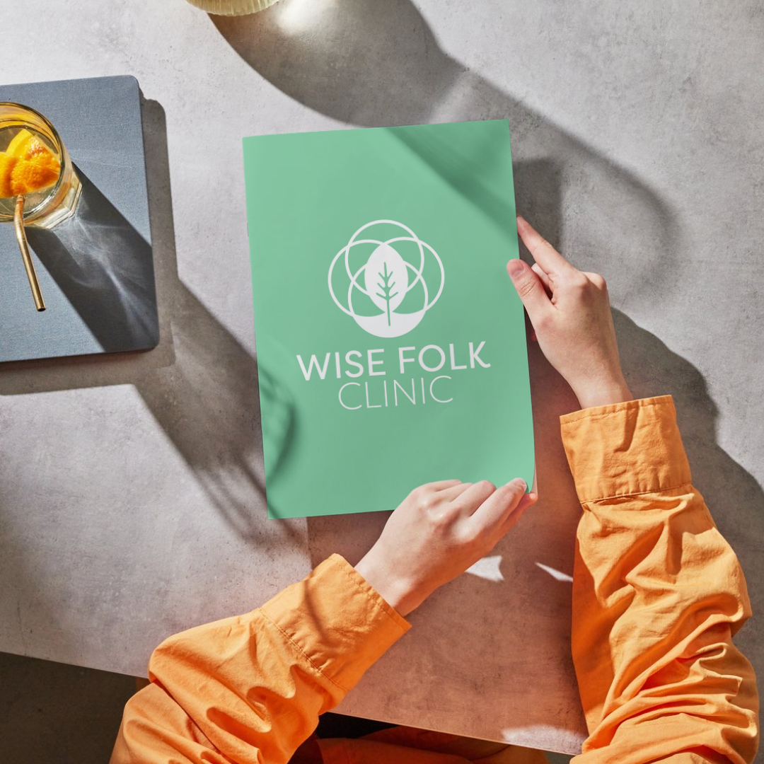
For Wise Folk Clinic, I created a calming, intentional brand identity inspired by the Flower of Life — a symbol of growth, balance, and interconnectedness that echoes the clinic’s holistic approach to mental wellness. The core logo icon draws from this geometric motif, paired with a clean wordmark to keep the look modern and welcoming.
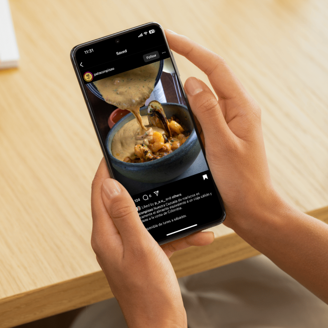
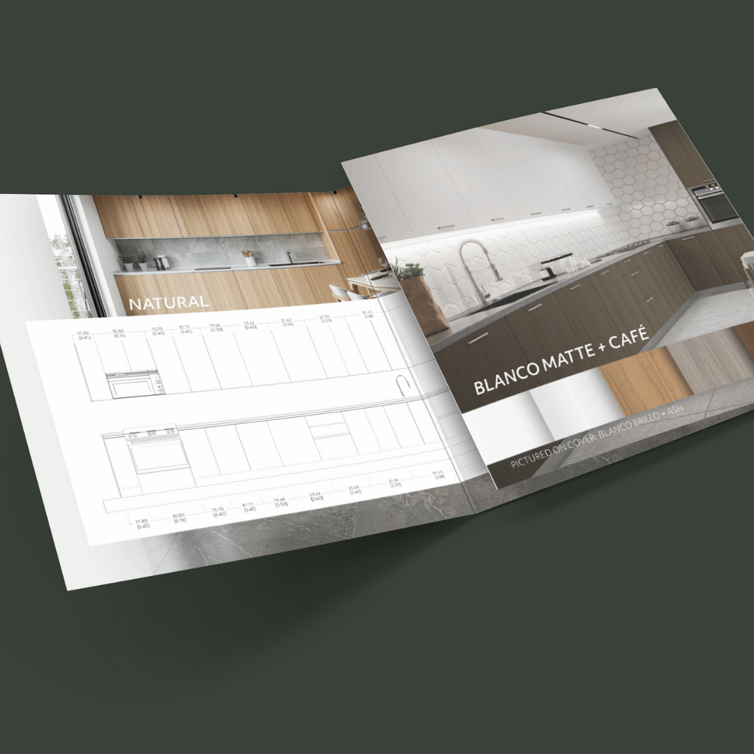
To make the brand adaptable across services, I developed a flexible color palette and a system of four distinct icons — one for each guide offered — giving each area of care its own recognizable color and symbol. This visual system works seamlessly across the website, social media, and other client touchpoints, making the experience feel both unified and easy to navigate.
Services: graphic design
Client: wise folk clinic
BRANDING OVERVIEW

How do I start working on a project?
Every branding project starts with understanding — who you are, what you stand for, and how you want people to feel when they experience your brand. We’ll talk through your story, your goals, and your audience so we can define the values and ideas that should guide every design decision.
Once we’re aligned, I translate that vision into a clear, practical identity. I craft the visuals, refine the messaging, and build out assets you can actually use — whether you’re a solo founder or a growing team. The end result: a brand that feels intentional, true to you, and ready to make a real connection.
My Working Proccess
We’ll dig into your mission, values, audience, and what makes your story worth sharing.
I’ll design the core identity — logo, colors, type, imagery, and tone — so it all works together naturally.
You’ll get clear, usable assets and guidelines to keep your brand consistent everywhere it shows up.